Worst to Best: Martin Scorsese Movie Posters
How do you advertise a filmography like Scorsese's? Sometimes extremely well. Sometimes less so.
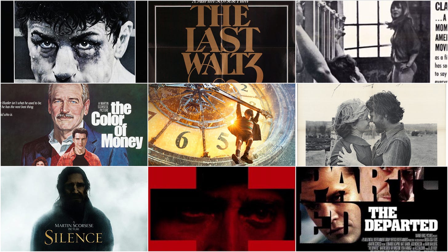
It’s impossible to rank the films of Martin Scorsese, whose work doesn’t easily lend itself to or benefit from that sort of exercise. (Unlike, say, superhero movies.) But Scorsese movie posters? Let’s give that a try. For this list, I’ve focused on the original U.S. one-sheet for each Scorsese film, which often doubles as a reflection on changing trends in movie poster art. (You want big heads? The ‘90s and the ‘00s will give ‘em to you.) With the rare exception at both ends of his career, Scorsese has made movies that play in mainstream theaters in wide release, but they’re not always easy sells and designing posters around them is no small challenge. Some great movies were saddled with lousy posters, but some of the best-received posters served them well. But let’s start with the lousy ones.
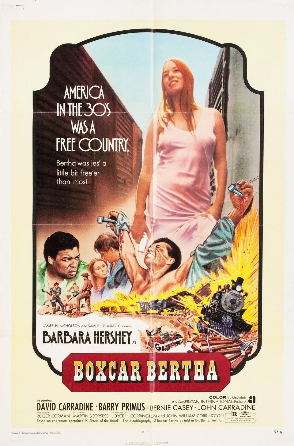
26. Boxcar Bertha (1972)
Scorsese made his second feature for Roger Corman at American International Pictures, a Depression-era lovers-on-the-lam movie. Part of a wavelet of Bonnie and Clyde-inspired films that crested in the early ’70s, Boxcar Bertha was a work-for-hire job and the least personal project in Scorsese’s filmography. Nonetheless, it seemingly proved a pretty tough sell for AIP, which was usually canny about boiling down its films to their commercial essence for its marketing campaigns. This poster is a disaster, mixing hand-drawn art with a still of star Barbara Hershey treated to match the images around it. Crucifixions! Train drama! Vintage lingerie! It’s all in the movie, sure, but it’s still not clear what this combination of images is selling.
25. Shutter Island (2010)
24. The Age of Innocence (1993)
23. Casino (1995)
22. Gangs of New York (2002)
21. The Departed (2006)
In some respects, the Boxcar Bertha poster foreshadows some of the problems faced by more deeply pocketed studios trying to sell Scorsese movies decades later. Scorsese hasn’t always benefited from the trends that have dominated poster design since the 1990s, which have emphasized photographs over original art and put the emphasis on the film’s stars above all other elements. Thus we get Leonardo DiCaprio’s head looming over Shutter Island without much of a sense of what he’ll find there (or much to set this apart from any ‘00s horror movie). The same problems can be found in posters for films as unlike one another as The Age of Innocence, Casino, Gangs of New York, and The Departed, all of which seem to be the result of a shrug. Here are the stars. Here’s a vague sense of what the movie’s about and a suggestion of its tone. Maybe check it out? Posters, of course, have to do double duty as advertising and art. These don’t really work as either one.
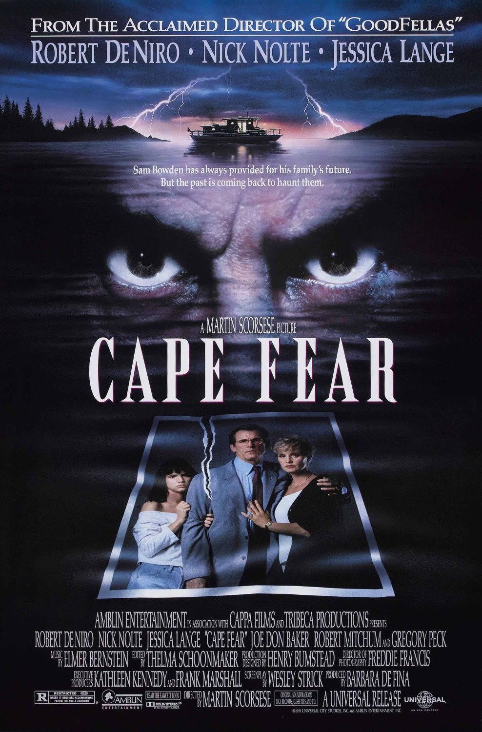
20. Cape Fear (1991)
The poster for Scorsese’s brutal remake of a 1962 thriller runs into some of the same problems but gets a few extra points just for the cheesy audacity of the torn photograph. It’s hard to call this a good poster, but it’s at least distinctive.
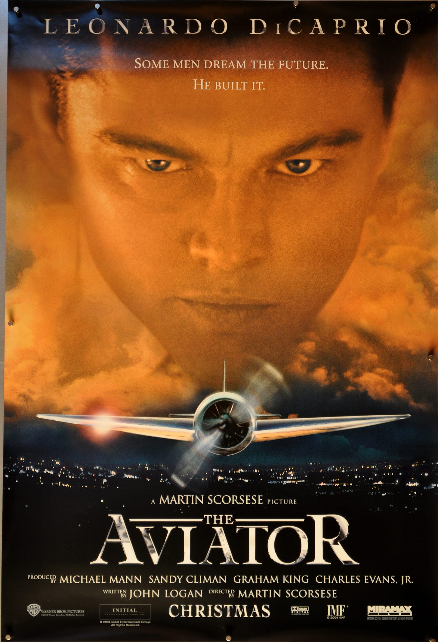
19. The Aviator (2004)
Yes, it’s another floating DiCaprio head, but this one gets a few extra points for moodiness and for going all the way to make his Howard Hughes look like a god staring down at the mere mortals below him.
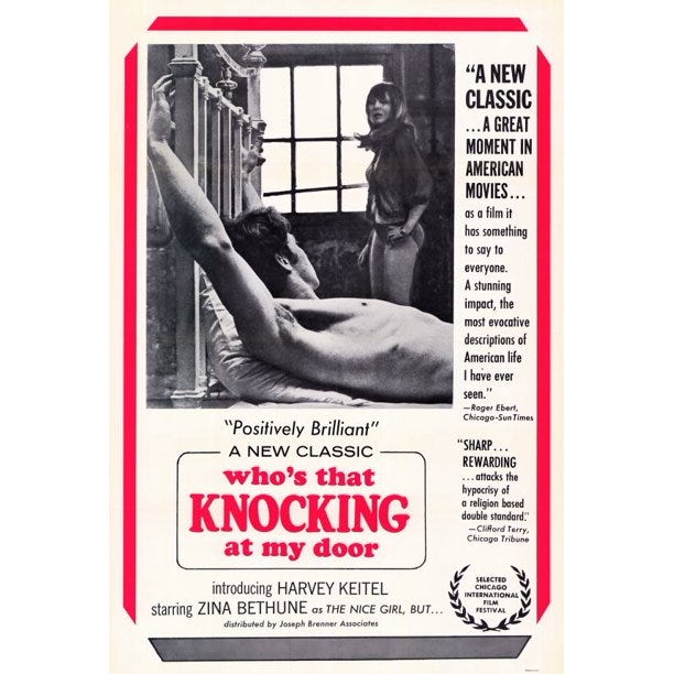
18. Who’s that Knocking at My Door? (1967)
Scorsese landed distribution for his debut feature only after agreeing to film some gratuitous (if beautiful) nude scenes. This poster trumpets the film’s artistry — including a quote from Scorsese early adopter Roger Ebert — but otherwise plays up the prurient appeal. Come for the sex, stay for the agonizing Catholic guilt.
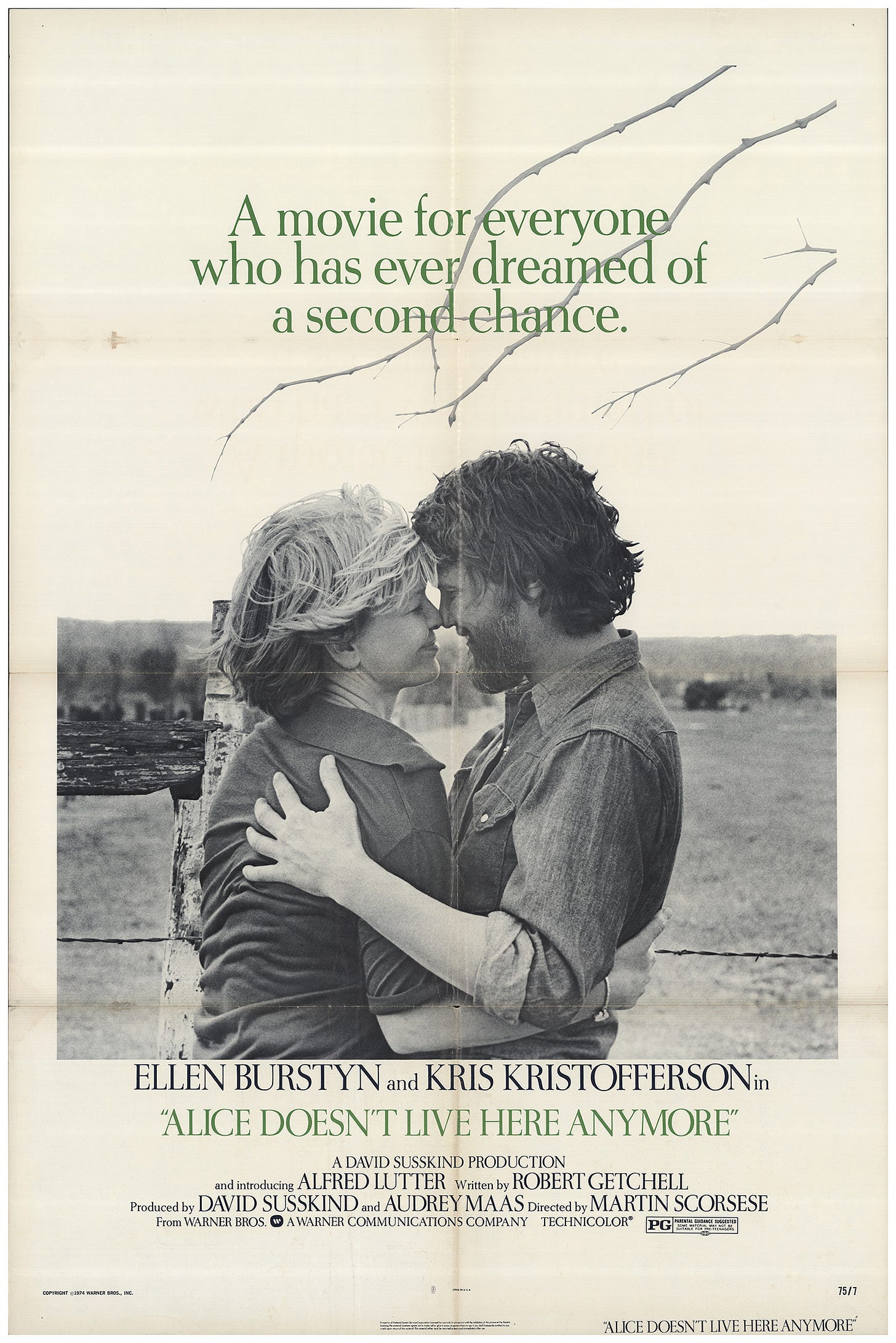
17. Alice Doesn’t Live Here Anymore (1974)
The wispy art of Alice Doesn’t Live Here Anymore’s international poster better conveys the feeling of the film than this lovely, if misleadingly upbeat, black-and-white image of stars Ellen Burstyn and Kris Kristofferson locked in an embrace. It’s striking, but it doesn’t really suggest the hard road leading up to this moment, or the complexity of the relationship it depicts.
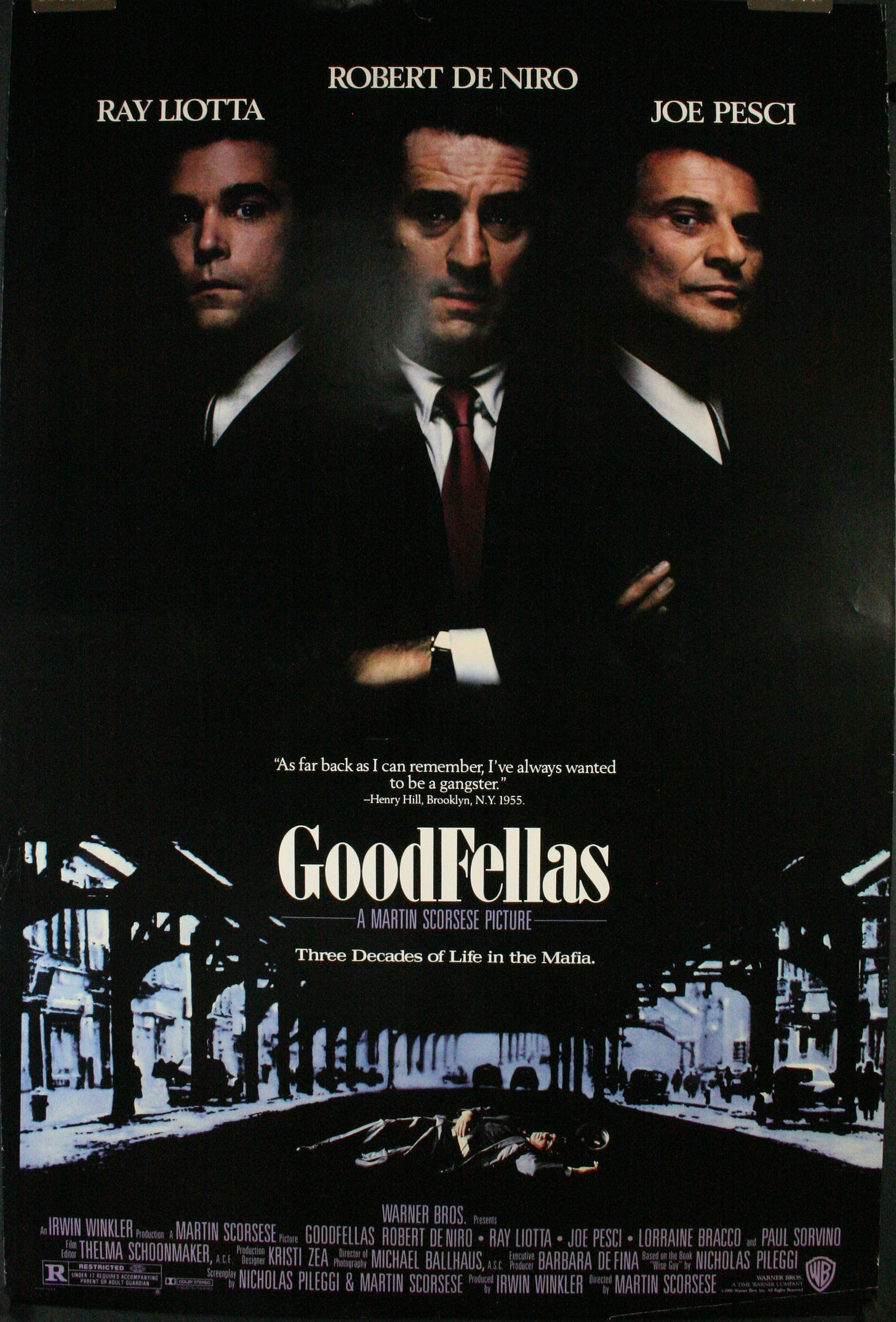
16. GoodFellas (1990)
It’s a dorm room staple to rival Gustav Klimt’s The Kiss but is GoodFellas’ poster good or just familiar? It’s certainly a little misleading, putting star Ray Liotta to the side of the better known Robert De Niro, who plays a crucial but decidedly supporting role. Also, the longer you look at the lighting, the less sense it makes.
15. Kundun (1997)
Another tough sell, this poster for Scorsese’s depiction of the early life of the Dalai Lama benefits from keeping it simple, surrounding its central character in golden hues. Still, it’s hard not to wish for a freer interpretation or the hand-drawn art that would have accompanied the film in an earlier era.
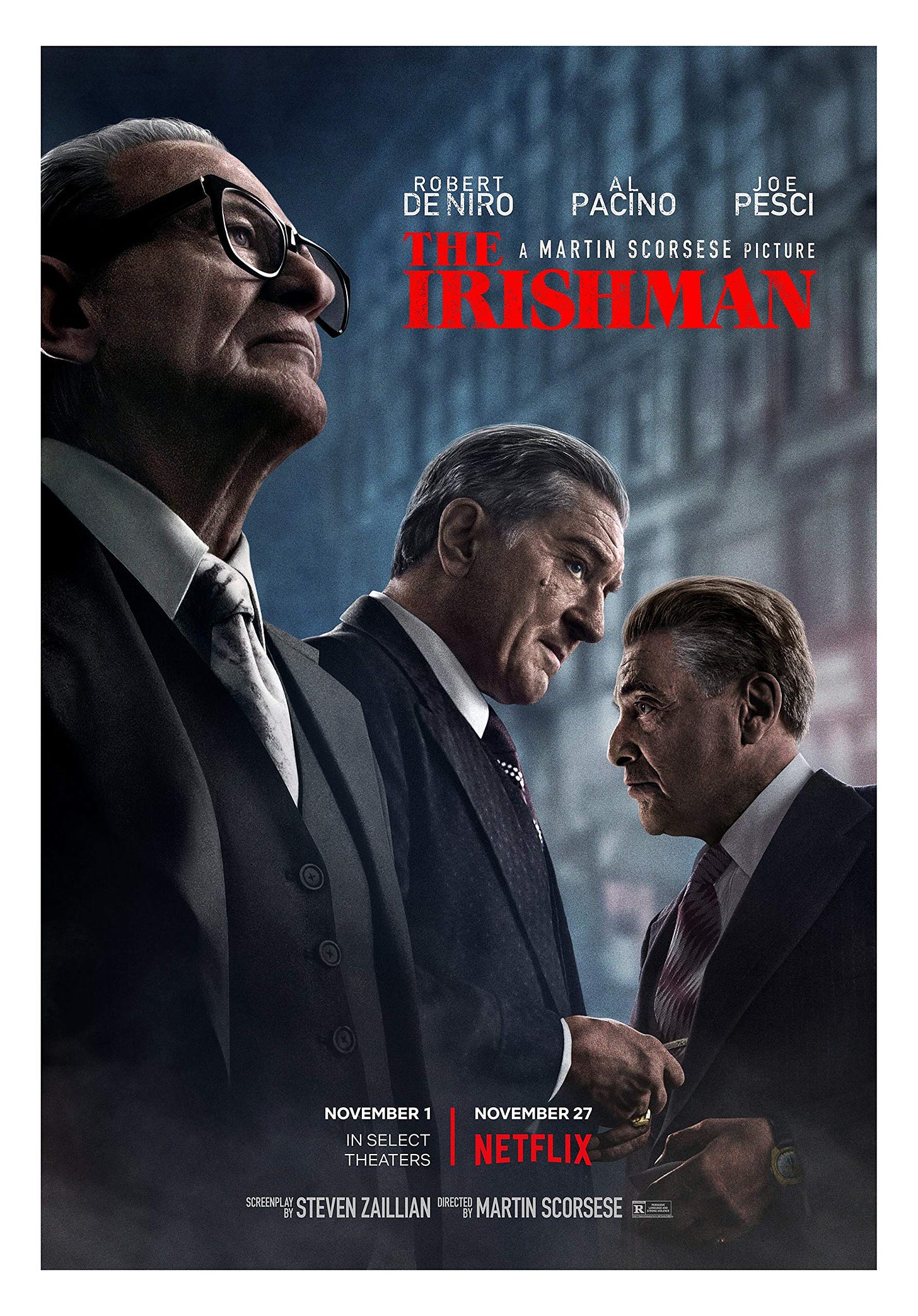
14. The Irishman (2019)
Produced by Netflix, Scorsese’s elegiac look at the underside of 20th century American history didn’t play in many theaters, but it did inspire this fine poster. The emphasis is, again, on images of the film’s stars but the dramatic composition suggests the dread and tension at the heart of the film.
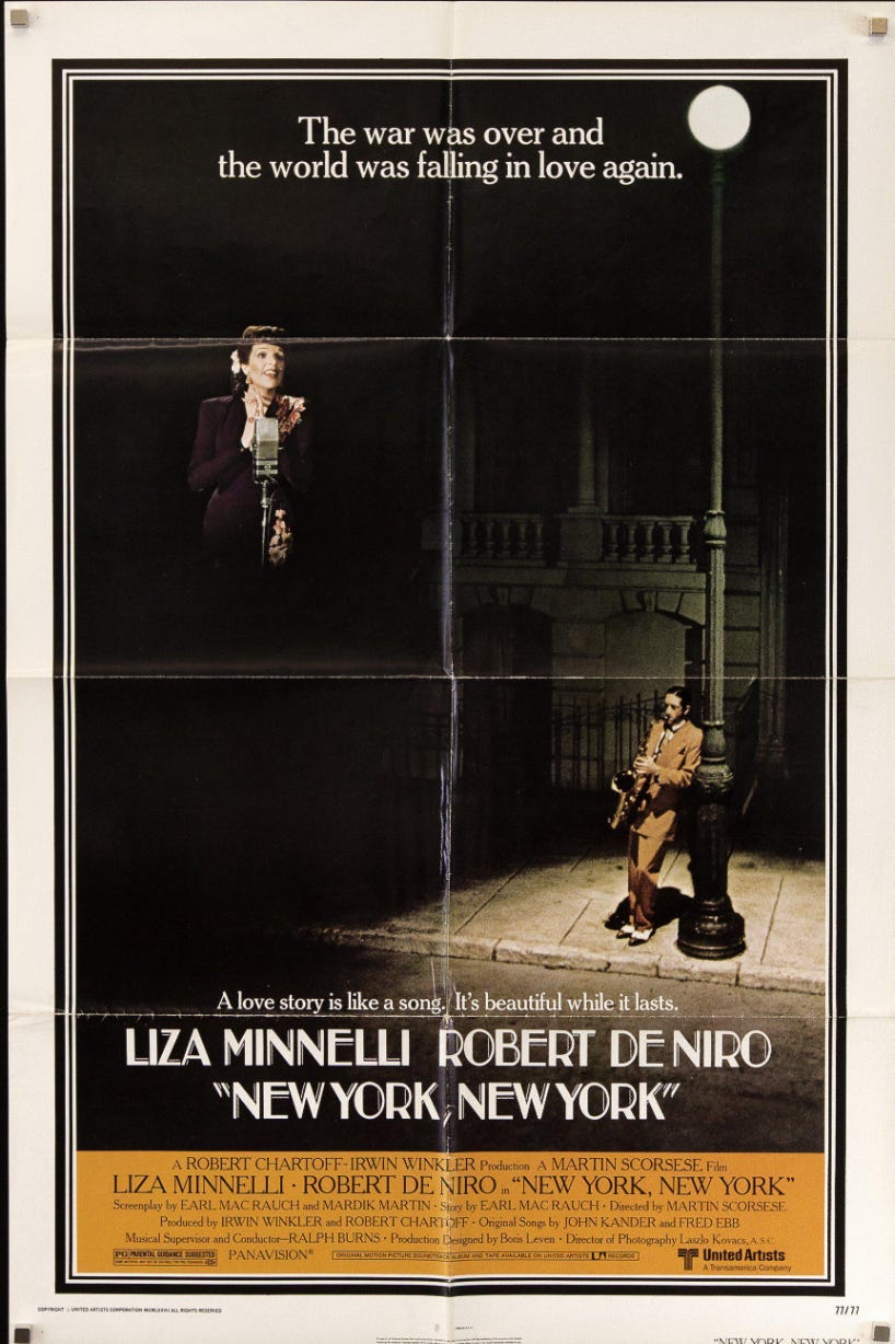
13. New York, New York (1977)
Scorsese’s troubled musical inspired several posters, none better than a reissue one-sheet featuring Al Hirschfeld caricatures of stars Liza Minelli and Robert De Niro. This austere initial poster isn’t bad either, however.
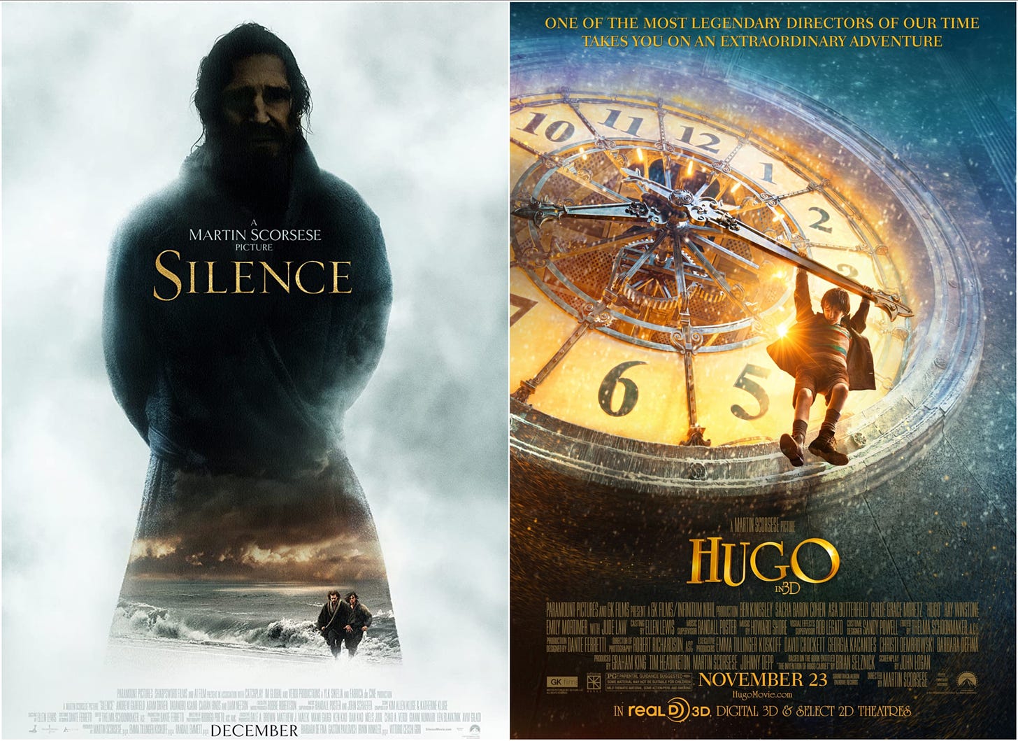
12. Silence (2016)
11. Hugo (2011)
Like The Irishman, these ’10s Scorsese films didn’t exactly avoid contemporary trends in poster design but they did bring some character to them. Hugo might look like a lost Harry Potter installment from a distance, but it’s a striking image that promises delights the film can keep. Silence is one of many of its era’s posters to feature an ominous dark figure against a white background (see also Maleficent and The Babadook, both from 2014), but it also suggests the film’s starkness and sense of isolation and peril. Each is stealthy in its own way, promising something familiar but also suggesting the unexpected.
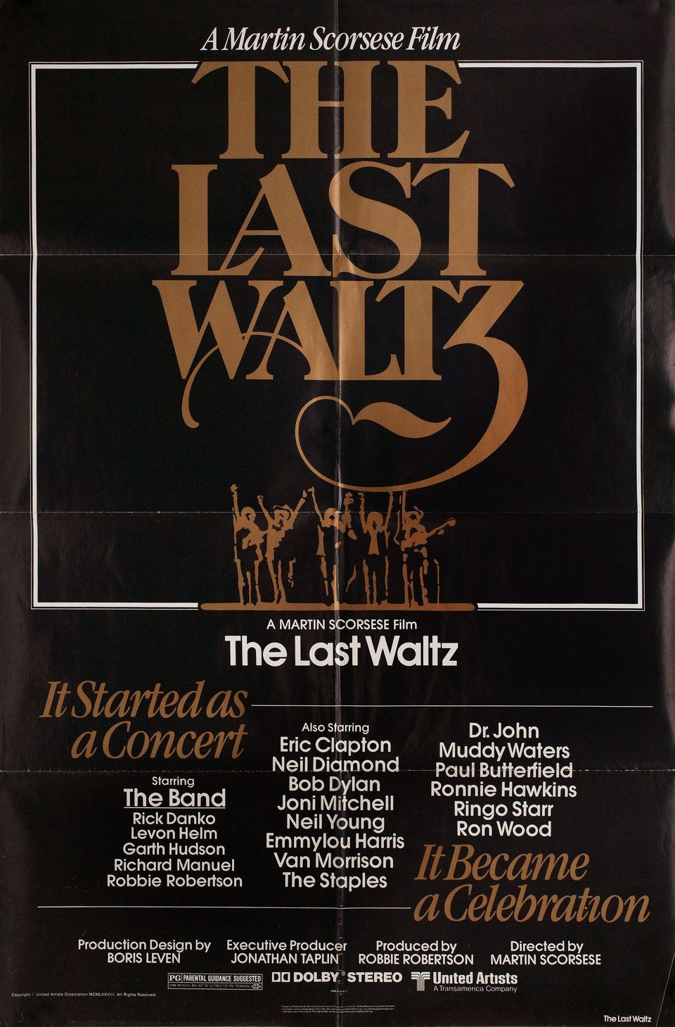
10. The Last Waltz (1978)
The temptation here would be to try to capture the excitement of the Band’s star-studded farewell concert. Instead the elegant font and silhouettes (and, of course, all those stars’ names) does all the stage-setting needed.
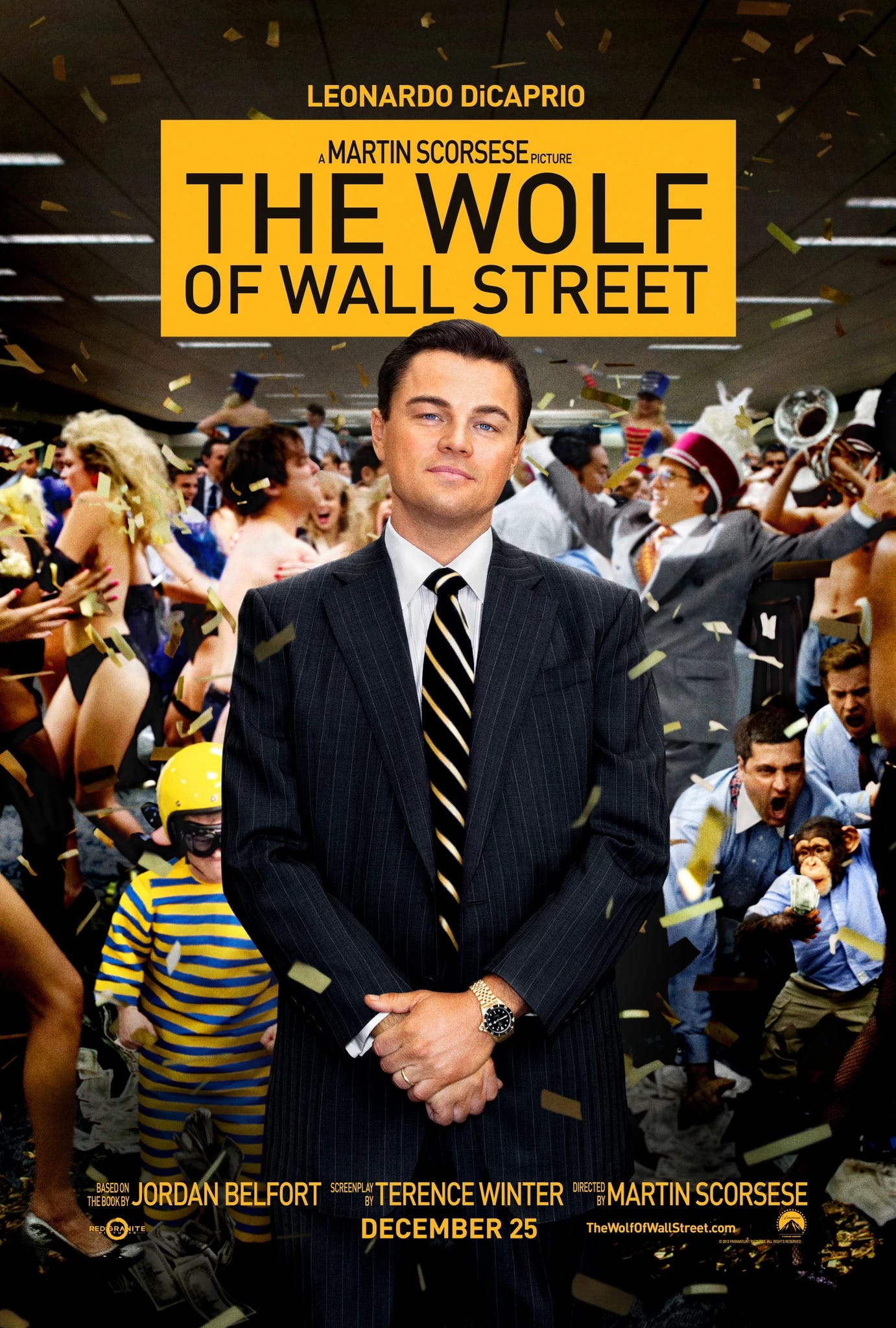
9. The Wolf of Wall Street (2013)
This isn’t the most artful poster made for a Scorsese film but the contrast between Leonardo DiCaprio’s serene “trust me” face and the chaos behind him (including a chimp wearing a suit) both nails what the film’s about and its nerve-racking comic imagery.
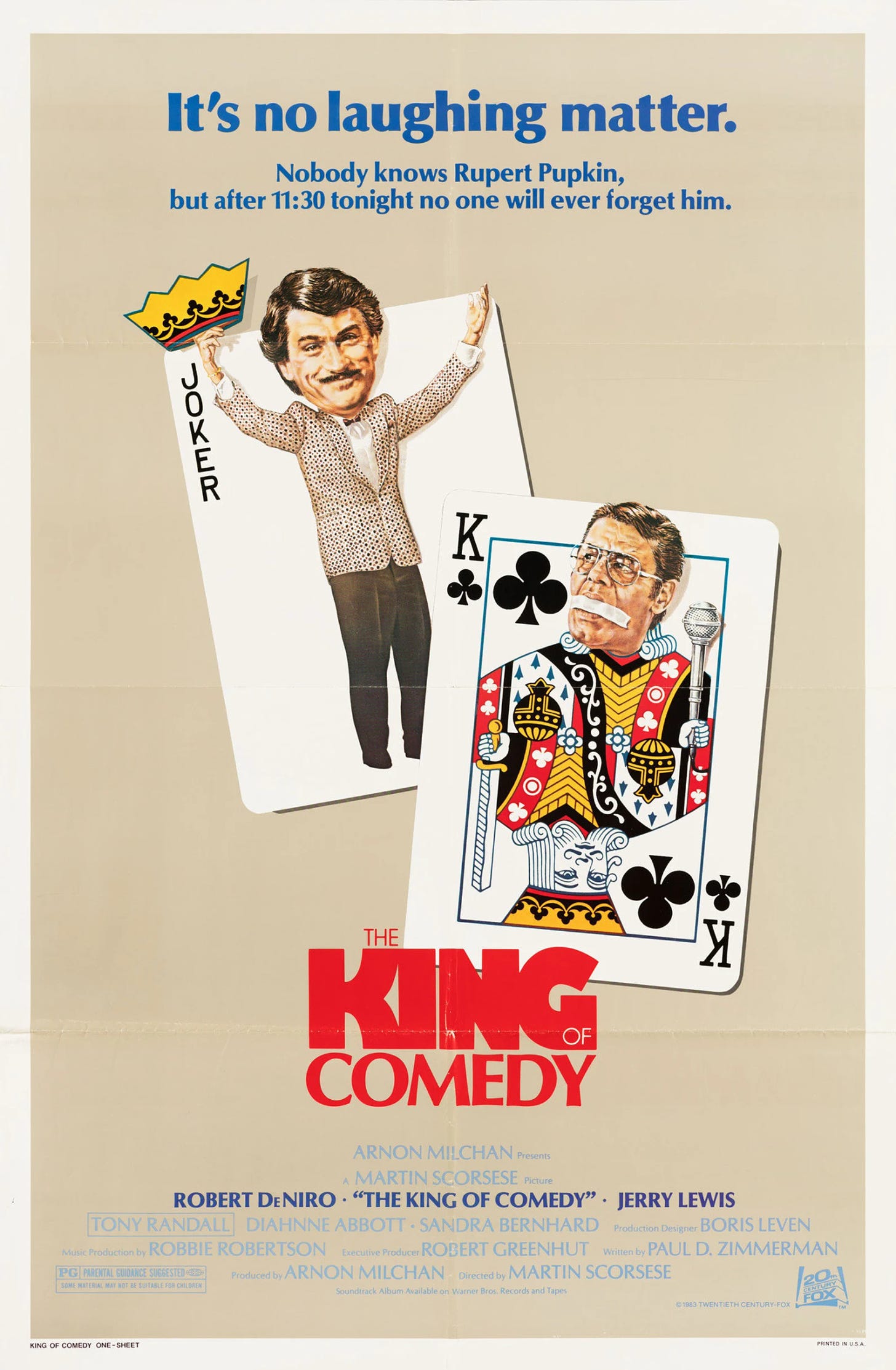
8. The King of Comedy (1983)
The poster for The King of Comedy, credited to the prolific advertising firm Kaiser Creative, might be a little too stealthy, promising a far more lighthearted evening out than the film delivers. Still, it’s a memorable image, however impossible its task.
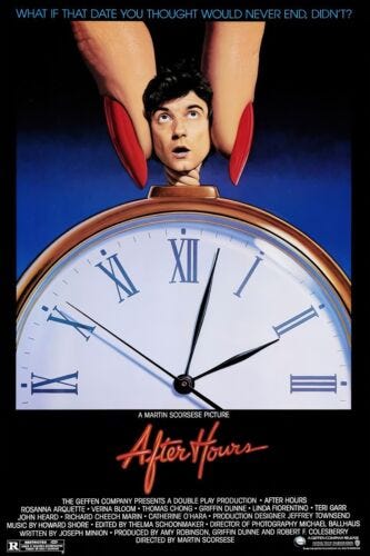
7. After Hours (1985)
Another memorable image in the service of a tough-to-classify film, this poster features the work of artist Marvin Mattelson. Now a fine artist specializing in portraiture, Mattelson worked for years as an in-demand illustrator. His other well known works include the poster for Raising Arizona and the cover of the bestselling Chant album, an early-’90s fixture from the era’s fleeting enchantment with Gregorian chant. Mattelson also created ads for Frank Zappa and provided cover art for National Lampoon, so this image more or less splits the difference between his respectable present and his irreverent past.
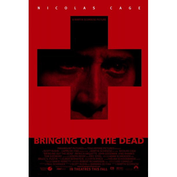
6. Bringing Out the Dead (1999)
The combination of Nicolas Cage’s weary, mournful eyes, a blood-red background, and a cross that suggested both ambulances and Christian symbolism pretty neatly encapsulates this film, even if it wasn’t enough to sell the movie to audiences in 1999.
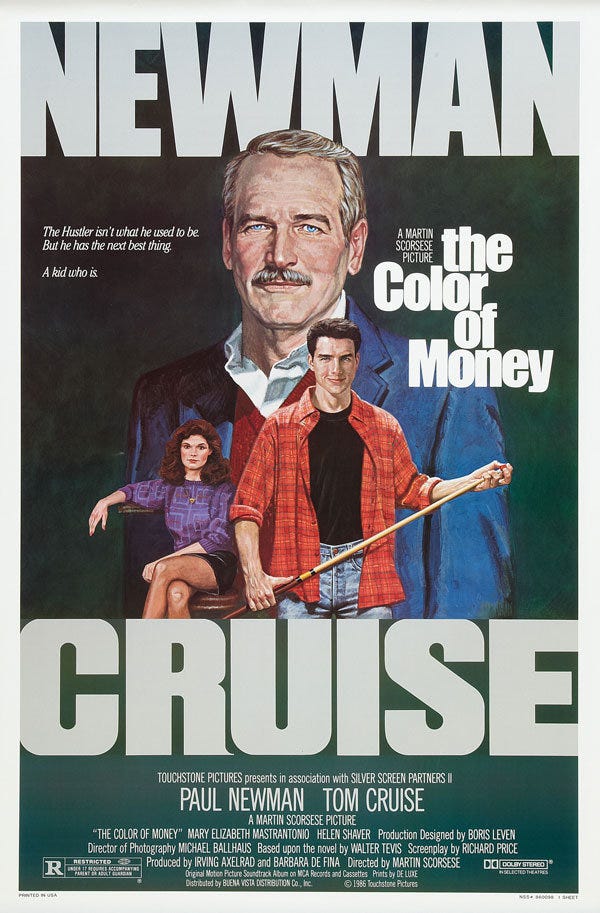
5. The Color of Money (1986)
Movie posters are just part of illustrator Robert Tannenbaum’s portfolio, but not an inconsiderable part given that he’s behind everything from the one-sheets for the blaxploitation classic Detroit 9000 to the Norman Rockwell-inspired poster for A Christmas Story. (Adrian Curry dedicated a typically fine Movie Poster of the Week column to him in 2014.) Tannenbaum’s The Color of Money is understated but powerful, neatly capturing its stars’ essences in a style reminiscent of sports illustrations, magazine covers, or Franklin Mint collectibles, all of which can also be found in Tannenbaum’s portfolio.
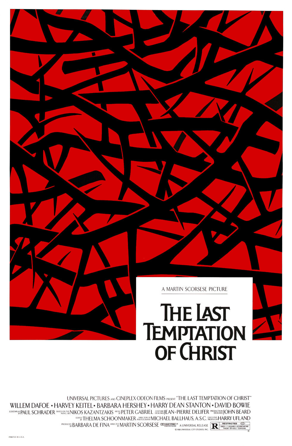
4. The Last Temptation of Christ (1988)
Graphic designers Joseph Caroff (the man responsible for the West Side Story poster, the 007 logo and more) and Lon Kirschner partnered for the somber, eye-catching poster that accompanied this Scorsese passion project. (An animated version of the same image can be seen in the film’s opening credit sequence.) It’s the simplest poster in the Scorsese filmography, and also one of the most effective, a serene, reverent image but one that does nothing to hide the blood and pain at the heart of the story.
3. Raging Bull (1980)
From across the room, it’s easy to mistake this image of Robert De Niro as Jake LaMotta for a photograph. It’s actually the hyper-detailed work of artist Kunio Hagio, an artist known for his lifelike work who died earlier this year. LaMotta looks mean and ready to strike down anyone in his path, including anyone looking at the poster, but there’s a vulnerability to his battered eyes. This is LaMotta in his prime, but the image already suggests what’s coming next.
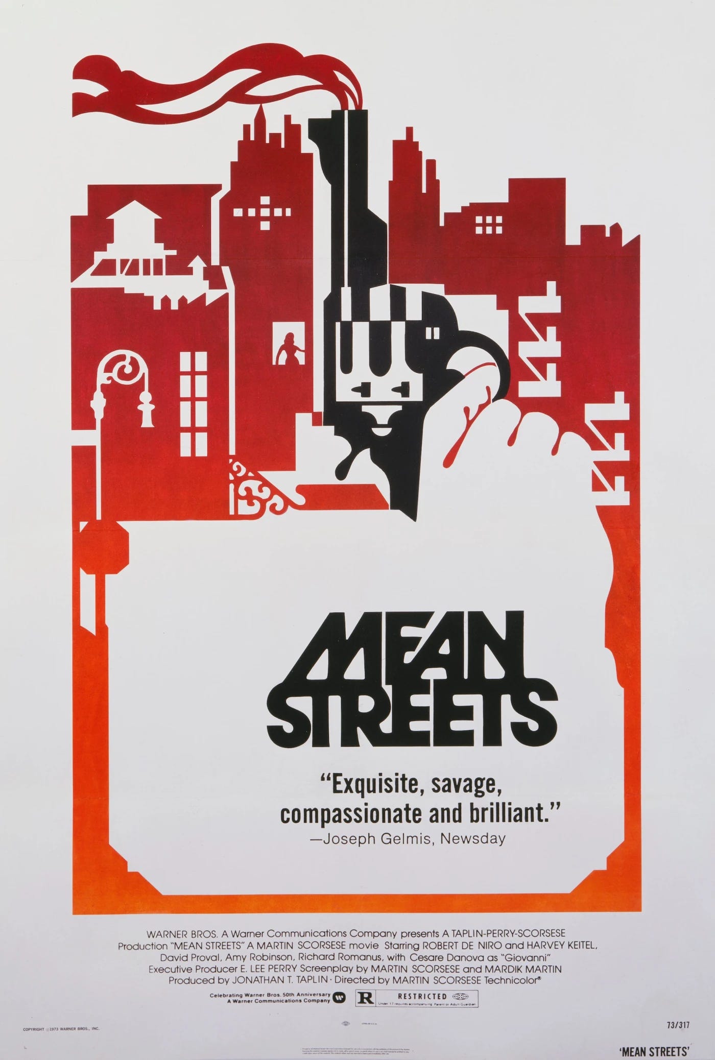
2. Mean Streets (1973)
Scorsese’s breakthrough movie inspired several notable posters, including a beautifully lurid action image used in its first Italian release and a UK re-release poster featuring a creepily goonish caricature of De Niro. But none top the original, U.S. poster, which turns a handgun into an object big enough to rival a skyscraper, as neat a shorthand for a film’s spirit as you’ll ever find.
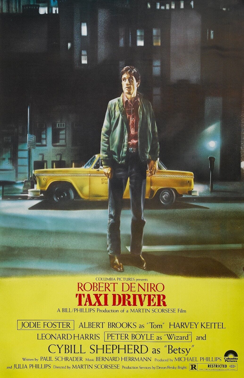
1. Taxi Driver (1977)
God’s lonely man is hauntingly rendered here by Belgian artist Guy Peellaert (just a few years after he turned David Bowie into an animal/human hybrid for the cover of Diamond Dogs). Peellaert captures Travis Bickle as he sees himself: at the center of a story in which he’s the hero and all the lights of New York turn the city into a stage for the drama in his head. Yet his face is anything but heroic. It’s twisted in anger and looking for a target. Like the film itself, it brings those looking at it disturbingly close to the psyche of a deeply damaged man.




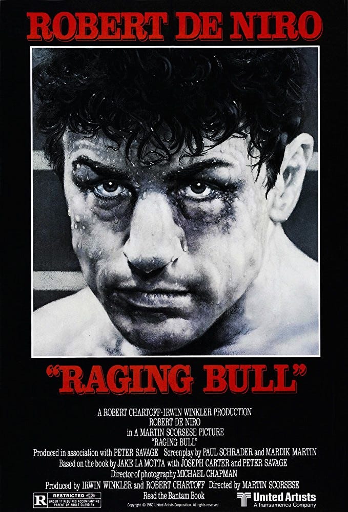
Before this, I don't think I'd ever realized that that wasn't a photo of De Niro on the "Raging Bull" poster.
What a cool idea for a column! I would love to see more poster reviews like this.